
I'm not going to get into what I think Web 2.0 is right now, but there is definitly a style to Web 2.0 graphics. The key word for Web 2.0 Graphics are SIMPLE & GRADIENTS. And sometimes that wet floor look. Add to that the "violator badge" (the funny looking star thingy) and viola!
If you have been visiting my blog since the beginning ( last week ) then you remember how the
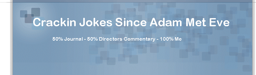 old banner looked. I had to reproduce this in "paint" because most blog banners here are just a background image with the words written in html.
Doesn't the new one look so much more friendly & inviting aka Web 2.0'ish. Now getting it to fit in the damn CSS was an exercise in jedi-like patience. But I got it. I also did a little market testing (mainly talking to myself) and changed the sub title of the blog from "50% Journal - 50% Director's Commentary - 100% Me" to something a little more catchy like "Now with 70% more sarcasm" to fit the violator feel. I also attached a joke to the joke of the title name. See it. I bet you did... What do you think?
PS: Come back tonight for another witty yet strikingly intellectual post from your's truly...


1 comment:
Damn CSS! I'm having slight issues with sidebar now after I put my ganster banner up. U probably didn't even notice until I told you huh?
Post a Comment